


7 Types of Forex Charts That Every Serious Trader Should Know About
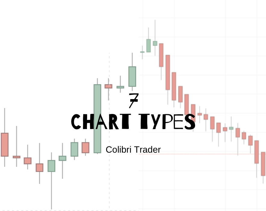
7 Types of Forex Charts That Every Serious Trader Should Know About
The rise of Personal Computers (PC) changed the way traders analyse prices. In fact, computers changed financial markets entirely, as algorithmic trading is a reality nowadays.
One of the areas most influenced is technical analysis. Back in time charts were held on paper, traders tracking prices every day. Different types of charts existed, but not so many options as there are today.
>>Bonus Material: Get the Free PDF ebook on Candlesticks<<
At least when it comes to the currency market, trading platforms offer various Forex chart types. From basic chart types to Heiken-Ashi, from the classic line chart to tick charts, the Forex trader has plenty of options at his/her disposal to analyse the fast-pacing currency markets.
With so many options on the table, the logical question is to find out which Forex chart type to use when analysing the market. In this article, I intend to have a quick look at the Forex chart types known today.
The aim is to find out their use, their pros and cons, and why one Forex chart is better than another. In the end, it is every trader’s choice what Forex chart types to use.
However, with this article, traders may find that some chart types better suited for their needs than the ones they currently use.
Contents in this article
Types of Forex Charts
Many types of Forex charts exist. We’ll cover here only a few ones, grouped in three different categories:
- basic chart types
- intermediate chart types
- expert charts
Besides the types discovered in this article, on various trading platforms, you might find others as well. For instance, area or line break charts.
Or, Kagi charts, range charts and even charts that use hollow candles. In other words, the diversity of Forex trading charts is the reason for this article.
Are all these Forex charts necessary?
Is there an advantage in using one type of chart over another?
Let’s start with the first type of charts…
Basic Chart Types
As the name suggests, the charts in this category are the simplest ones possible. Here, I will walk you through the line, bar and tick charts. However, as you’re about to find out, tick charts aren’t that easy to compile and interpret.
Tick Charts
A tick chart is the closest form of charting price action. Often traders compare a tick chart with the one-minute chart.
However, the reality is that tick charts represent something else. The information comprised of a tick chart is not just the classic OHLC for every period.
Instead, a tick chart draws bars (or candlesticks, etc.), based on the number of transactions that take place on the market.
Did I get your attention now?
For instance, a 1000 tick chart “draws” bars every thousand transactions. Hence, the key is to be able to count the transactions in the market.
But, that’s quite hard in the Forex market. Using tick charts in the currency markets is the equivalent of using VSA (Volume Spread Analysis) on Forex charts.
As you can probably imagine, a Forex broker doesn’t show the entire volume in the currency market. It only shows the volume that corresponds with its trading activity, the one its customers are responsible for.
Hence, the volume trading strategies won’t work for the simple reason that the information provided is arbitrary. Or, incorrect.
The same is valid for the tick chart. Any given Forex brokerage house can’t give the total number of transactions on a currency pair. Thus, tick charts aren’t used much in Forex trading. A simple look on any Forex trading platform reveals the fact that tick charts aren’t even offered as an option to analyse the market.
Line Chart
A line chart is the most basic form to chart the currency market. Perhaps one of the simplest Forex chart types, line charts’ main advantage is just that: their simplicity.
Despite the basic information provided, there are some variations among line charts. Before anything, we need to define it: it is a chart that shows merely the relevant price of the period.
Moreover, the line connects the relevant prices, providing the much-needed information for analysing the market. A line chart looks like below:

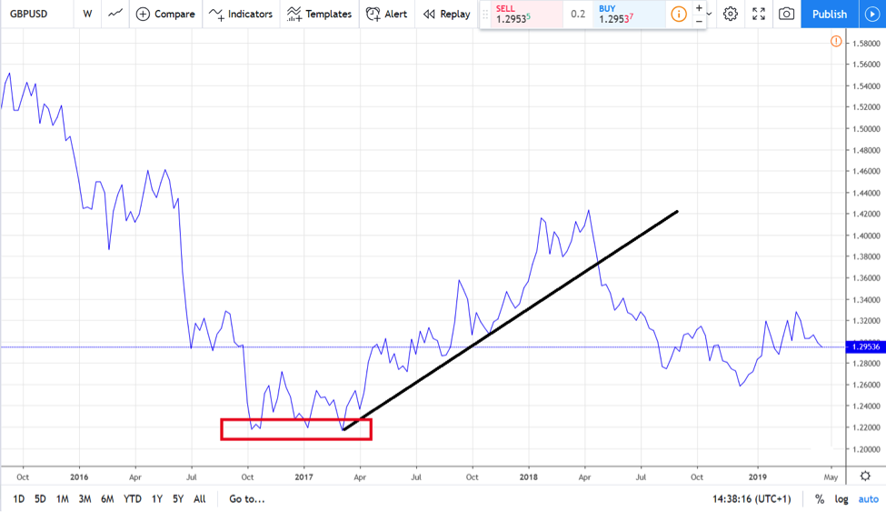
This is the representation of the GBPUSD weekly chart on TradingView. The line connects the closing prices of each week.
On top of that, it simply ignores the other price action during the trading week. In fact, to draw a similar chart, all you need to do is to know the weekly closing prices on the GBPUSD.
So that’s how to build a line chart.
But then, there are different prices to use…
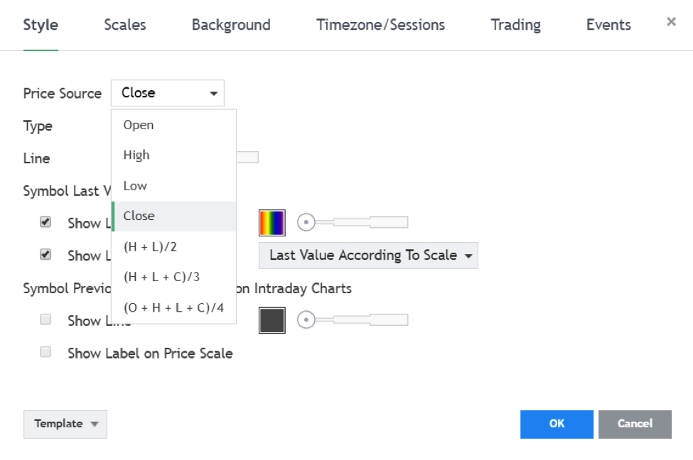
Different types can use open, high, low, or close values. Moreover, variations of these prices are based on different formulas, as shown above.
The simplicity of the line chart makes technical analysis easier, too.
Traders can quickly identify patterns like the triple bottom below. Or, they can use the info provided by line charts to remain in the relevant trend, without letting the “noise” within a period to distract them.
While a simple approach to charting, line charts aren’t that useless as many believe. With the rise in popularity of the candlestick chart, line charts have became more or less obsolete.
However, veteran traders use them to this day, as a simple way of discovering and interpreting the current price levels.
Bar Chart
A bar chart is the closest form to the most popular chart in the retail trading word: the candlestick chart. Unlike the line chart, a bar chart shows all the price action within a period.
The high, low, open and close prices play an essential role in a bar chart. Basically, a bar has:
- a vertical line
- a small point on the left showing the opening level
- one small point on the right of the vertical bar, indicating the closing level
In simple words, a new bar continues the price action from where the old bar left it. Here’s the same GBPUSD chart from above using bars:
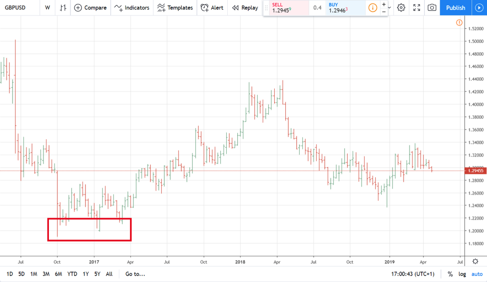
What’s interesting here is to note the pattern we’ve spotted on the line chart: the triple bottom. When using bar chart instead of a line chart, the pattern changes. It doesn’t look like a triple bottom anymore, as the bars consider the price action before the closing price too.
Bar charts are one of the oldest forms of charting. They became extremely popular once Personal Computers became more prevalent in technical analysis models.
Nowadays, we can say that only veteran traders still use bar charts. Out of all Forex chart types, bar charts are probably the least popular nowadays.
Up until the appearance of candlestick charts, bar charts were favoured.
This is not the case anymore.
Intermediate Forex Chart Types
Every trader has heard of technical analysis and how it works. The funny thing is that, when thinking of trading, people instantly think of Wall Street.
It is true that technical analysis came from the United States.
But, only one part of it.
The so-called Western technical analysis uses mostly a pattern recognition approach. Chart patterns like head and shoulders, rising and falling wedges, double or triple bottoms, cup and handle, rounding tops and bottoms, ascending and descending triangles, etc. belong to this type of technical analysis.
Also, major trading theories that traders still use today were born in the States. But again, it doesn’t mean technical analysis came only from that part of the world.
As it turned out, the Japanese used patterns to predict future prices well ahead of the year 1800. They used candlesticks to document price action and build patterns likely to repeat in time.
This is how the candlestick charts appeared. And, today, they represent the number one choice for the Forex trader.
Candlestick Charts
Naturally, candlestick charts use candlesticks. Similar to bar charts, candlestick charts:
show the entire price action in a period: the high, low, open and close.
A candlestick has two main elements- body and shadows.
The body
This is the price action between the opening and the closing prices. Also named the real body, it typically has red colour (on bearish trading days) and green (on bullish ones).
Based on the real body’s length, a candlestick tells much about the price action within the candlestick’s formation.
The shadows
A candlestick has an upper shadow, lower shadow or both.
Shadows, too, give clues about what the price action was. And, more importantly, about what the future prices might be.
Together, the real body with the shadows of a candlestick are critical elements in defining relevant patterns. Called Japanese candlestick patterns, they revolutionised technical analysis and were introduced to the Western world.
We can say with certainty that the Western traders embraced them very fast. Because of their efficiency, Japanese patterns quickly outstripped the other forex chart types.
Here are some of the most famous candlestick chart patterns:
- morning and evening star
- doji
- southern doji
- northern doji
- gravestone doji
- bullish and bearish engulfing
- hammer and shooting star
- piercing and dark-cloud cover

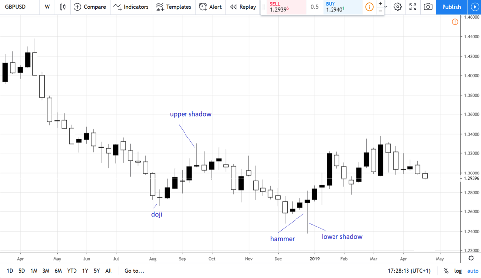
Above is the same GBPUSD weekly chart. Only this time, we use candlesticks for each period.
What’s between the upper and lower shadows represents the real body. The two examples shown here, the doji and hammer, are relevant enough, reflecting the true power of candlestick charts.
Expert Trading Charts
For the traders looking to go the extra mile, expert trading charts exist.
These are: Heiken-Ashi, Renko and point and figure charts.
Traders use these kinds of charts to spot false market moves. Or, to better ride the main trends, by filtering false breaks.
Two of the Forex chart types in this category come from Japan. The other one uses one of the oldest trading theories in the world in order to filter the inactive periods on any trading chart.
Heiken-Ashi
Meaning “average bar” in Japanese, Heiken-Ashi charts make trends easier to spot. Also called a “better candlestick” than the classic candlestick, the Heiken-Ashi candlestick is a great choice for professional traders.
It uses a mathematical formula to average the open, low, high and close prices for the current and previous candlesticks using no less than four different criteria.
We won’t go into details here on how exactly to calculate each candlestick, but the result totally differs from a regular candlesticks chart.
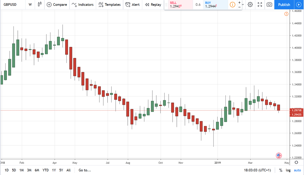
As the chart above shows, the candlesticks are more uniform, making it easier to ride trends. From left to right, it looks obvious here that the GBPUSD recently formed a double top (on the left side of the chart) around the 1.44 mark only to dive in a strong bearish trend later.
Renko
Meaning “brick” in Japanese, the Renko chart type measures the price movement of a currency pair. It uses a similar concept with the last Forex chart type we’ll discuss here, the point and figure chart.
Namely, a Renko chart only adds a new “brick” to the chart if price moves a certain, predefined distance. That, obviously, is the key to Renko charting, but who decides where to set the right distance?
We know now that not all currency pairs have similar volatility. Some are more volatile than others.
For instance, the GBPUSD has a higher historical volatility than the AUDUSD pair. Or, the GBPCHF when compared with the AUDNZD cross.
Thus, a consensus builds up. Trading platforms use the ATR (Average True Range) and a period of fourteen, to determine the size of the predefined distance.
If the price action exceeds that distance, the chart plots another brick. Here’s the same GBPUSD with Renko bricks:
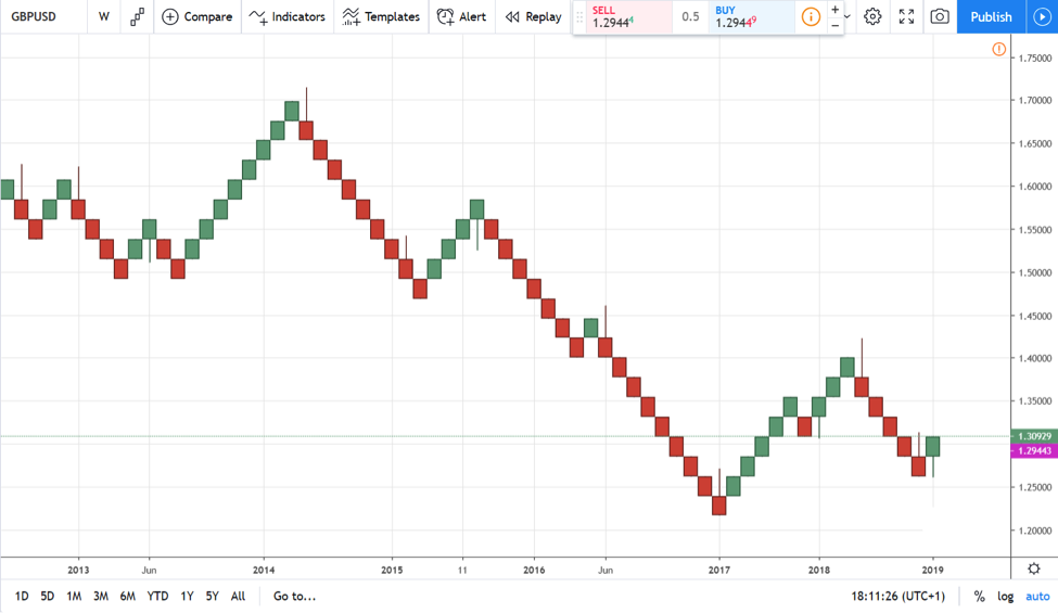
Spot the main advantage of this type of Forex chart: the period analysed is much bigger. This chart, for instance, covers the entire price action from 2013 until 2019. Or, more than five years.
Point and Figure Charts
Point and figure charts resemble Renko charts. Their purpose is similar to that of Renko: to filter the time when the market consolidates and only to display relevant candles when the market is on the move.
 The same ATR is the preferred method to build the boxes for the point and figure charts. Known as charts built only with X and 0 vertical columns, point and figure charts compress time even more than the Renko charts.
The same chart we used throughout this article contains the price action for the last two-and-a-half decades when using the point and figure method.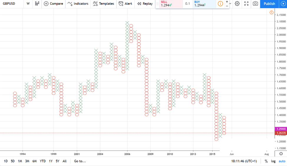
The difference from the earlier type of chart presented here (Renko) is that the point and figure adds a new X or 0 on the vertical. Instead, the Renko chart adds a new “brick” on the right side of the previous one.
Traders like this approach because of its trending predictability. Since, it is literally close to impossible to miss a significant trend using Renko and point and figure charts, they are preferred more by long-term investors rather than swing traders or scalpers.
Which Type of Forex Charts Do I use in My Trading?
There’s no straight answer to this question. However, perhaps the best answer comes based on each trader’s trading style.
Take scalpers, for instance. These traders enter and exit the market several times a day.
Moreover, they target small and very small market moves. Scalpers, if you want, are the equivalent of algorithmic trading applied to human execution.
For a scalper, tick charts or one-minute charts aren’t a surprise. They use timeframes up to the hourly one to spot reversals, ride small trends, and so on and so forth. Usually, scalpers trade with bigger volumes, too.
A big majority of retail traders are scalpers. And, almost all retail traders use candlesticks charts. Hence, it is not hard to guess what the most probable Forex chart type scalpers use is.
Swing traders use intraday trading a lot. Being the more patient type of traders, they let the price reach their target.
Depending on the strategy, candlestick charts and Heiken-Ashi work best for swing traders.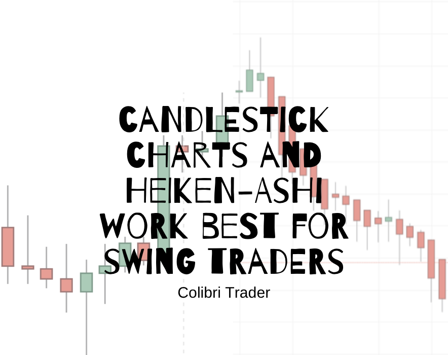
Finally, investors don’t have a time issue. Typically, an investor has a bigger trading account.
The funds in the trading account aren’t used for anything else but for profiting from market moves. The daily life costs don’t depend on the performance of the trading account on a finite basis.
With this hurdle out of their way, it is easier to stay in long-term trends. Renko charts and point and figure ones work best when time is not an issue.
Before we proceed to the conclusion, I have created a short video detailing all the above mentioned forex chart types, except for the tick chart for obvious reasons. Here it is:
Conclusion
Regardless of the Forex chart types used in trading, one factor stays valid: with PC’s becoming more and more powerful, technical analysis as we know it today will evolve too.
Therefore, the chances that new types of charts will appear are high. And, perhaps, depending on how the market’s volatility evolves over time, the charts will become easier to interpret and understand.
For today’s retail trader, the candlesticks chart is the number one choice. However, it doesn’t mean it is the best choice. Instead, it is the one chart that integrates the price information good enough for traders to use many strategies and theories.
One final word: don’t despair if some trading platforms don’t offer all the Forex chart types you want to use. In the case of the MT4 or MT5, that’s easy to solve, by uploading some indicators and templates on the platform.
In the end, it is up to each trader what Forex chart types are suitable for their own style. With so many chart types, there’s one for every possible strategy that exists.
Happy Trading,
Colibri Trader
p.s.
Have you checked my full article on Candlestick charts
Thanks Colibri, you have now convinced me to abandon my old regular candlestick charts & instead use Heiken-Ashi charts for intraday short term trading analysis on TradingView. Old time traders like me, age 72 years young, tend to stick to their old fashioned proven ways far too long but thanks to you I have now “seen the light” & am now moving on. Please do keep up the great analysis reports.
Thanks for the nice words Ed- it is just another way to see the trends more clearly! I am glad I could help you with my observations and articles! Always a great pleasure and you are always more than welcome 🙂